Technical Notes
User Interface:
Figure 1 highlights the starting screen of the Kentucky Education to Workforce GIS Application. The initial starting screen begins with a prompt that allows the user to be taken through a tour of the application. To start the tour click on the blue button on the left. To skip the tour click the blue button on the right of the initial prompt.
The main user interface includes essential mapping tools like zoom control, screen panning, and search. The active legend allows users to view the map color legend, opacity control, color control, and layer order. The map also has export options for screenshots and .pdf download. Also, the map has “pop-up” capabilities that allow users to select map features to see important attributes in a temporary window. The left side of the user interface contains eight icons (“widgets”) that contain the main data elements for the application. The widgets included in the application are Graduate Projections, Enrollment Projections, Industry Projections, Education Pipeline, Census Data, Education Attainment, Population Projections, and Structural Conditions. Each of the widgets contain “drawers” that further organize the data layers by data source. The layers in each of the widgets can be overlayed to reveal important relationships.
Figure 1: Kentucky Education to Workforce GIS Application Starting Screen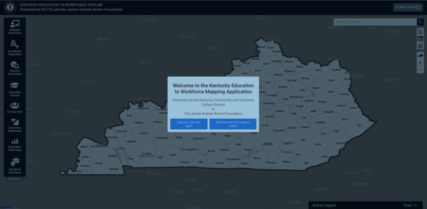
Data:
The data used to create the application were collected from the Kentucky Community and Technical College System (KCTCS), the Kentucky Department of Education (KDE), the Council on Postsecondary Education (CPE), Kentucky Center for Statistics (KyStats), Kentucky State Data Center (KSDC), Council on Environmental Quality (US Gov), the Bureau of Labor Statistics (BLS), the National Incident Based Reporting System (NIBRS), and the U.S. Census Bureau. These data sources are used to create a unique combination of education and workforce data that provide a multidimensional perspective on education and workforce alignment in Kentucky. The application design team consulted with experts from State organizations to establish data needs and organize the scope of the application.
The application aggregates most data points to the county level; however, some layers are at the institution, census tract, and census block level. County level aggregation was selected as the main unit for the application due to the availability of data and the flexibility to aggregate to higher order aggregations like local workforce areas (LWAs). Where possible, layers are aggregated to smaller spatial scales like addresses (points), Census tracts (neighborhood proxy), and Census blocks (sub-neighborhood). Also, for applicable data, the application includes LWAs and “all county” aggregations so users can easily compare a single county to its LWA or the entire state.
Suppression
To ensure the data presented in the application are anonymous and unidentifiable any aggregated data points with fewer than 10 records were suppressed. In instances where time-series data were interrupted due to suppression, synthetic data were used to fill gaps allowing the time-series to be used for estimation purposes (time-series analyses do not like gaps in the data). Thus, any value displayed in the application that is less than 10 was synthetically created by the research team for estimation purposes only. In some instances, count-based data (which should only be whole numbers) may display with decimal values because the values are statistically estimated.
Statistical Methods:
Forecasting:
A key principle in the development of the application was to focus on the future of education and workforce alignment in Kentucky. Taking a proactive approach focused on the future steered the project design team toward the development of education and workforce forecasts that allows the application to align with state strategic planning efforts that are currently focused on years 2026 and 2030. Predicting the future is a challenging task because it is impossible to anticipate all the factors that drive education and workforce supply and demand. Additionally, predicting the future for each county in the state is difficult because each county has unique needs, challenges, and opportunities that impact education production and workforce demand. Because of the large number of counties and industry sectors, the design team created a flexible forecasting algorithm that produces high quality forecasts on a large scale and offers easy manipulation of specific county forecasts if the general algorithm produces unlikely outcomes.
Random-Forest Forecasting:
Forecasts in this application were built using one of two methods. The first, and the one by which the majority were built, is a machine learning method called random forests. The random forest forecasts are estimated in ArcGIS PRO using ‘space-time cubes’, which are three-dimensional data models used to organize data with space and time dimensions. The forecast model is constructed by building a series of decision trees called “forests” that are used to estimate each time series for each spatial unit (e.g., county).
Further information detailing the method (such as training the model, extending the scale) can be found here: How Forest-based Forecast works—ArcGIS Pro | Documentation.
In some instances, the data used to create the forecasts had missing data points throughout the time series. To address gaps in the time series the forecast algorithm interpolated values when it was feasible using a linear interpolation technique. To ensure the interpolation procedure was appropriate, some data series were eliminated due to a lack of available data. Limiting the forecasts to industries that have a minimum number of data points bolsters the accuracy of the forecasts that are produced by relying on observed data. Additionally, each data series has unique conditions that the algorithm can be adjusted to address. Several time series were enhanced by incorporating predictor variables, lagged variables, or other parameter adjustments that produce more logical forecasts. These adjustments help moderate the forecasts in various ways to produce outcomes that are more likely given the historical performance of the data.
Auto-ARIMA Forecasting
The second method utilized autoregressive integrated moving average (ARIMA), which is a class of statistical models that are applied to time series data for the purpose of forecasting future events. The ARIMA model is composed of three components, which are labeled p, d, and q. p is the autoregressive component of the model that captures the impact of past values on present and future values; d is the differencing of data to produce stationarity1 in the model; and q is the moving average component that captures dependency between lagged observations. The ARIMA model requires the selection of the most appropriate combination of p, d, and q to produce the best estimates. Typically, the ARIMA model is shown using (p,d,q) notation following the calculation of the ARIMA model to indicate the conditions applied in the model. For example, the simplest model is (0,0,1) which is a simple moving average model that predicts the dependent variable based on a first order moving average. There are several options for selecting the best model including examination of Mean Absolute Percentage Error (MAPE), Akaike Information Criterion (AIC), and Bayesian Information Criterion (BIC) statistics. Due to the large number of forecasts needed to produce county-level coverage of education and industry time trends, a flexible algorithm was needed that “searches” for the best possible ARIMA model by simultaneously estimating models with multiple combinations of p,d, and q. The forecast algorithm then selects the model that results in the lowest level of prediction error. All forecasts in the application were created using STATA 16. For a more detailed discussion of STATA’s forecasting methods explore the STATA reference manual for ARIMA models.
This forecast algorithm can estimate up to 16 models for each variable in each county, which produces many forecast “candidates” from which the algorithm can choose. However, due to data limitations some forecast adjustments can produce fewer candidate forecasts for the algorithm to choose from, which is typically true of data series that are short in duration or that have low volume and high frequency (i.e., variation). After the forecasts were calculated and selected, the research team evaluated and adjusted the models when needed. For example, in some instances strongly declining time trends yielded negative job forecasts, which is not possible in the real world. In those situations, the research team tested various adjustment to determine the best fitting models. An important point to emphasize is that both forecasting methods used building this application may be altered as new information arises. These forecast adjustments will not occur regularly but will be made in response to new knowledge or insights related to specific counties or industry sectors.
Trend Layer Analysis:
In addition to forecast layers, the application also includes layers that display time trends. The key purpose of the trend layers is to display, in a single map, the direction of the time trends in each county. Where forecasts layers show what the forecasted variable will look like in one year, the time trend layers show how the county’s industry sector trajectories are changing across years. The data structure used to calculate the trend layers is three-dimensional (3D), which means variables are measured both spatially and temporally. Formally, this data structure is called a space-time cube because when data are visualized in 3D they appear to look like stacks of cubes. Figure 2 shows an example of a space-time cube for manufacturing jobs in Kentucky counties measured each year from 1990 through 2019. Each year is represented by a single cube, which is stacked to create a tower-like shape. The top of the tower is the cube representing the final observation and the cube at the bottom of the tower represents the first observation. When the 3D maps is converted to a 2D map, the image below becomes flat and the counties are shaded to indicate whether the time trend is increasing, decreasing, or not changing.
Figure 2.1: QCEW Space-Time Cube for Manufacturing Jobs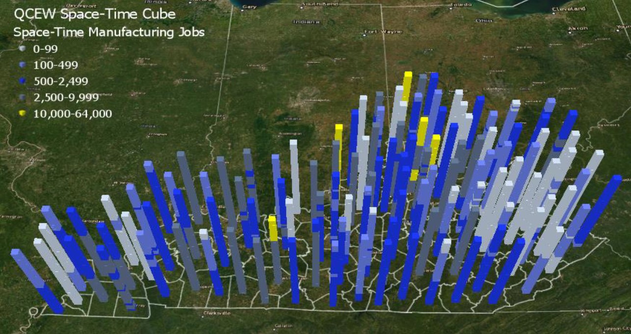
The space-time cubes can be applied to the forecasted data by applying additional analyses that evaluate and visualize the growth patterns of the forecasts. The trend analysis categorizes counties based on the direction of their trends. The classification of the counties based on the direction of the time trend is determined by the Mann-Kendall trend test. The Mann-Kendall trend test is a rank correlation analysis, which means each time point is compared to the next time point in the series and then given a score of +1, 0, or -1 indicating whether the trend increases, decreases, or has no change. The changes are summed across the time series and then compared to the expected sum, which is zero. If the summed scores deviate significantly from zero, then the county is assigned to an increasing or decreasing group depending on the direction of the trend. If the scores are not significantly different from zero, then the county is classified as having no significant trend. The main advantage of the trend layers is that they allow users to view each county’s time trend simultaneously. This allows users to explore the spatiotemporal aspects of the data by viewing time and space patterns on a single map. For a more detailed discussion of the calculation of trend layers see the ArcGIS Pro reference guide.
Figure 2.2: QCEW Trend Layer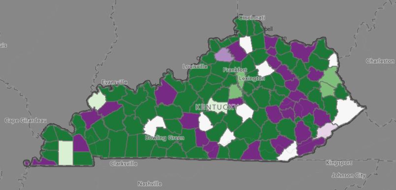
Industry growth trends in KY. Color indicates direction and intensity of trend.
Widget Details:
Graduate Projections:
The Graduate Projections widget measures the number of graduates by industry sector in each county. Graduates are linked to counties based on data indicating each student’s home county. Graduates are defined as the number of unduplicated individuals who received a credential within a specified industry sector. Some graduates earned multiple credentials that align with different industry sectors. In instances where individuals earned multiple credentials in the same industry sector they were only counted once, but individuals were counted once for each credential in each industry sector. Therefore, layers displaying “all educational program” graduates, which are created by summing the number of graduates in across all industry sectors, are overestimated due to duplication, so caution should be used interpreting the number of graduates for “all educational program” layers. Table 1 displays the data sources used in the Graduate Projections widget, CIP code level, time-series period, and types of degrees included in the calculations.
While KCTCS is a part of CPE, throughout the document, KCTCS graduates are presented separately from CPE graduates to create distinct indicators for 2-year and 4-year institutions. Therefore, CPE is used throughout the application to represent the public 4-year institutions in the state and KCTCS is used to indicate the public 2-year institutions in the state.
The data in the Education Projections widget are in time-series format, which is advantageous because it allows forecasting methods to be used. The “projections” drawers contain layers that include the historical and forecasted number of graduates by home county and industry sector. The “trend” drawers display the trends in county forecasts. The trends are classified as increasing, decreasing, or not changing.
| Source | Description | CIP-Level | Time Series | Degree Type(s) |
|---|---|---|---|---|
| CPE | Public 4-year + KCTCS Graduates | 2-Digit | 2005-2021 |
|
| KCTCS/CPE | Public 2-year Graduates by Program | 2-Digit | 2000-2021 |
|
| CPE | Public 4-Year Graduates by Academic Area | 2-Digit | 2006-2021 |
|
Enrollment Projections:
This widget was added to present data on current and future enrollment in KCTCS as well as K-12 enrollment. KCTCS projections are built on data from 2000-01 to 2021, forecasted out to 2030. 99%+ of current and former students are included. Projections and trend forecasts are built using the same methods as those in the Graduate Projections widget. K-12 projections are built on data between 2006-07 to 2018-19, sourced from KDE. Table 2 below shows additional information on Enrollment Projections.
| Source | Description | Time Series |
|---|---|---|
| KCTCS | KCTCS Enrollment Projections and Trends | 2000-2021 |
| KDE | K-12 Enrollment Projections | 2006-2019 |
Industry Projections:
Quarterly Census of Employment and Wages (QCEW): Total Jobs and Average Weekly Wages
The Quarterly Census of Employment and Wages is a U.S. Bureau of Labor Statistics program that publishes quarterly data on the number of jobs and average wages reported by employers covering more than 95% of jobs in the United States. QCEW data allows users to understand spatial and temporal changes in jobs and wages across 20 NAICS industry sectors. The QCEW data was collected from KyStats and is also in time-series format (1990 – 2021). Again, the time-series data are used to produce forecasts of jobs and wages in each county and across the 2-digit NAICS industry sectors. The industry projection metrics identify the number of jobs in each industry sector and the industry trends visualize the county-level time trends of jobs by industry sector. Counties in the trend layers are classified based on the degree to which the time trend is increasing, decreasing, or not changing over time. The wage projections identify the average weekly wage for each industry sector, and the wage trends show the county-level time trends of wages by industry sector.
Quarterly Workforce Indicators (QWI): Job Creation
Quarterly Workforce Indicators (QWI) is a dataset produced by the U.S. Census Bureau that measures 32 different workforce and economic indicators, such as employment, job creation/destruction, wages, and hires. These data are connected to characteristics like geography, age, industry, and size as well as worker demographics. Available data can be measured to the national, state, metropolitan/micropolitan areas, county, and workforce investment areas (WIA). By tracking workplace and worker characteristics over time, QWI data allows for longitudinal analyses of various issues concerning employment, labor market needs, and economic health.
Within the Kentucky Education to Workforce Pipeline dashboard, QWI data were utilized to measure job growth over time in 20 industries as well as predict future job growth in those industries out to 2030. The inclusion of QWI data within the application allows users to assess employment trends across different industries at different points in time, enabling them to make informed decisions about education, investment, and future economic prospects. Currently QWI is used to build out the Job Creation Projections/Trends in the application – an estimate of the number of jobs gained in each CIP code defined industry. The inclusion of this widget allows users to see the counties with the most new jobs, the industries most likely to create new jobs, and which industries are most likely to create jobs that younger or entry level workers are likely to obtain. For more detailed information about the QWI visit the U.S. Census website. Table 3 below contains additional information on the data used producing this widget.
Figure 3.1: QWI Job Creation Projections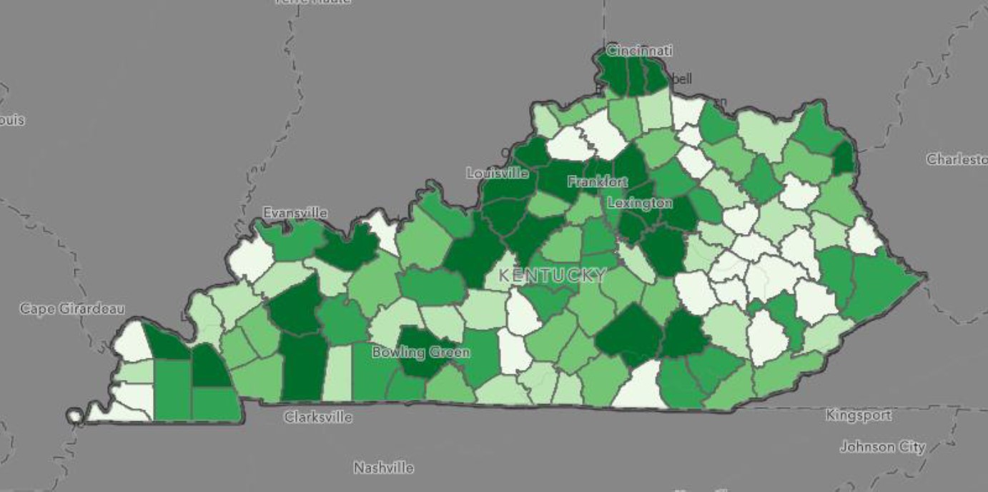
QWI Job Creation Projections. Counties are binned 1-5 based on value, represented
by color intensity.
| Source | Description | Time Series |
|---|---|---|
| QCEW | Total Jobs | 2000-2021 |
| QCEW | Average Weekly Wages | 2000-2021 |
| QWI | Job Creation | 2002-2019 |
Education Pipeline:
The education pipeline widget contains several layers that measure and visualize networks of programmatic offerings by secondary and postsecondary institutions. Table 4 highlights the layers used to create the Education Pipeline widget.
The main data structure for the pipeline layers is a duplicated list of educational institutions where each record is linked to data points that determine the types of programs offered, the mobility of students from high schools to postsecondary institutions, and mobility of dual credit/dual enrollment students from high schools to postsecondary institutions. The education pipeline data is recorded at the institution level (point level), which allows for the creation of network maps that visualize the mobility network throughout the state. The drawers included in the Education Pipeline widget include:
- Education Programs Offered by Kentucky Institutions: Institution level layers that display the locations and program inventory of institutions by industry sector. The displayed institutions include all available P-20 institutions.
- Postsecondary Matriculation Networks: Institution level layers that track the movement of students from Kentucky’s high schools to postsecondary institutions. The layers can be used by postsecondary institutions to determine which high schools are most likely to supply graduates who enroll at their institutions.
- High School Dual Credit/Dual Enrollment Networks: Institution level layers that track the movement of dual credit students from Kentucky’s high schools to postsecondary institutions. Allows institutions to determine where dual credit students go to college after graduation.
- 2019 School Ratings: Institution level layers highlighting the KDE ratings for Kentucky’s high schools. KDE ratings are based on the KDE five-star rating system which is explained in detail on KDE’s website.
- Education Institution Locations: Institution level layers displaying the locations of KDE, KCTCS, and CPE institution locations. Kentucky Schools Technology Access: Institution level layers displaying KDE data on school technology access.
- Adult Literacy: County level layers displaying percentage of adults at 3 literacy levels.
| Layer | Type | Year | Source |
|---|---|---|---|
| High School to Postsecondary Networks | Point and line | 2019 | KyStats |
| High School Dual Enrollment Network | Point and line | 2019 | KyStats |
| High School Dual Enrollment Rates | Point | 2019 | KyStats |
| Elementary School Accountability | Point | 2019 | KDE |
| Middle School Accountability | Point | 2019 | KDE |
| High School Accountability | Point | 2019 | KDE |
| KDE School Districts | Polygon | 2020 | Census |
| KCTCS Enrollment Clusters | Polygon | 2020 | KCTCS |
| KDE High School Locations | Point | 2019 | KDE |
| KCTCS Main Campuses | Point | 2019 | KCTCS |
| KCTCS All Campuses | Point | 2019 | KCTCS |
| CPE Public Four-Year Campuses | Point | 2019 | CPE |
| Kentucky Schools technology Access | Point | 2019 | 2019 |
| Adult Literacy | Point | 2020 | 2020 |
Census Data:
The Census Data widget includes a set of layers that measure important socioeconomic conditions throughout Kentucky, all sourced from the American Community Survey (ACS) done by the United States Census Bureau. The widget is divided into subsections based on whether it is at the county or census tract level, and whether it is a cross section or time-series analysis. The county level cross section contains the following layers: individual poverty rate, unemployment rate, civilian labor force participation rate, median income, veterans, public assistance, access to computing devices, access to internet services, health insurance coverage, and Gini index measure. Timeseries measures include those above, with additional categories for breakouts (gendered and educational level rates of poverty, extra veteran demographics) Computer and internet access could not be projected, however, as the US census has only recently begun including that information in 2015.
Cross sectional variables are included in Table 5 below.
| Layers | Type | Year(s) | Source |
|---|---|---|---|
| Individual Poverty Rate* | Polygon | 2015-2021 | U.S. Census |
| Unemployment Rate | Polygon | 2015-2021 | U.S. Census |
| Civilian Labor Force | Polygon | 2015-2021 | U.S. Census |
| Veterans* | Polygon | 2015-2021 | U.S. Census |
| Public Assistance | Polygon | 2015-2021 | U.S. Census |
| Access to Computing Devices | Polygon | 2015-2021 | U.S. Census |
| Access to Internet Services | Polygon | 2015-2021 | U.S. Census |
| Health Insurance Coverage | Polygon | 2015-2021 | U.S. Census |
| Gini Index | Polygon | 2015-2021 | U.S. Census |
| Male Poverty Rate | Polygon | 2015-2021 | U.S. Census |
| Female Poverty Rate | Polygon | 2015-2021 | U.S. Census |
| No GED Poverty Rate | Polygon | 2015-2021 | U.S. Census |
| College Educated Poverty Rate | Polygon | 2015-2021 | U.S. Census |
| College Veterans | Polygon | 2015-2021 | U.S. Census |
| No GED Veterans | Polygon | 2015-2021 | U.S. Census |
| GED Veterans | Polygon | 2015-2021 | U.S. Census |
*Layers have additional time series breakouts.
Education Attainment Projections:
The Education Attainment Projections widget visualizes county-level education attainment forecasts out to 2030. Data was sourced from 2011-2019 US Census measures on educational attainment. County-level time series data were collected for several education attainment subpopulations including the population who have less than a 9th grade education, no high school education, a high school degree, an associate degree, a bachelor’s degree, or a graduate or professional degree. Additionally, the education attainment projection layers include three layers that measure the percent of the population earning a high school degree or higher, an associate degree or higher, and a bachelor’s degree or higher. These projections are unique from other education projection layers in the application because the layers capture the percentage of the population that have earned a specified credential at the time of the U.S. Census survey rather than the number of graduates that specific institutions produce each year. Figure 4 below shows an example popup for a forecasted layer, as well as an accompanied graph visualizing the forecasted time trend.
Figure 4: CPE 60x30 Projection Popup
Figure 4: Popup of Jefferson County in the 'CPE 60x30' layer. On the right, a graph
contained in the popup showing the time trend out to 2030.
The main motivation for including the education attainment projections in the application is that state strategic planning efforts by KCTCS and CPE have a focus on increasing education attainment rates in the state. CPE’s overarching goal is for 60% of Kentucky’s population over age 25 to have a postsecondary credential by 2030. CPE’s 60-by-30 goal is a statewide goal, but it is likely there will be substantial variation in the ability of each Kentucky county to achieve the goal. Therefore, the education attainment projections provide new insights into the 60-by-30 goal by providing county-level forecasts of education attainment out to year 2030. The insights of looking at specific counties can provide insights into where the 60-by-30 goal is likely to be achieved and where additional resources may be needed to achieve the goal. Additional information on how the Educational Attainment layers were built are located in Table 6 below.
The 60x30 metric is calculated by combining education attainment variables for associate’s degree or higher among the population over age 25. One limitation of using Census data for this calculation is that the U.S. Census does not currently collect data on certificate and diploma completion as separate credential categories. However, under CPE’s definition of 60x30, certificates and diplomas count toward the attainment goal, and in fact, certificates make up the largest total volume of credentials due to their relatively short time-to-degree. To address this limitation, we added 50% of the Census education attainment category “some college no degree” to create an estimate of students who have completed short term credentials, but may not have completed an associate’s degree.
| Educational Attainment Projections | Type | Year | Source |
|---|---|---|---|
| CPE 60x30 Education Attainment (Projection) | Polygon | 2011-2019 | U.S. Census |
| Less than 9th Grade (Projection) | Polygon | 2011-2019 | U.S. Census |
| No High School (Projection) | Polygon | 2011-2019 | U.S. Census |
| High School (Projection) | Polygon | 2011-2019 | U.S. Census |
| Some College (Projection) | Polygon | 2011-2019 | U.S. Census |
| Associate degree (Projection) | Polygon | 2011-2019 | U.S. Census |
| Bachelor’s Degree (Projection) | Polygon | 2011-2019 | U.S. Census |
| Graduate or Professional Degree (Projection) | Polygon | 2011-2019 | U.S. Census |
| High School or Higher (Projection) | Polygon | 2011-2019 | U.S. Census |
| Associate degree or Higher (Projection) | Polygon | 2011-2019 | U.S. Census |
| Bachelor’s Degree or Higher (Projection) | Polygon | 2011-2019 | U.S. Census |
| Educational Attainment Trends | Type | Year | Source |
|---|---|---|---|
| CPE 60x30 Education Attainment (Trend) | Polygon | 2011-2019 | U.S. Census |
| Less than 9th Grade (Trend) | Polygon | 2011-2019 | U.S. Census |
| No High School (Trend) | Polygon | 2011-2019 | U.S. Census |
| High School (Trend) | Polygon | 2011-2019 | U.S. Census |
| Some College (Trend) | Polygon | 2011-2019 | U.S. Census |
| Associate’s Degree (Trend) | Polygon | 2011-2019 | U.S. Census |
| Bachelor’s Degree (Trend) | Polygon | 2011-2019 | U.S. Census |
| Graduate or Professional Degree (Trend) | Polygon | 2011-2019 | U.S. Census |
| High School or Higher (Trend) | Polygon | 2011-2019 | U.S. Census |
| Associate’s Degree or Higher (Trend) | Polygon | 2011-2019 | U.S. Census |
| Bachelor’s Degree or Higher (Trend) | Polygon | 2011-2019 | U.S. Census |
Population Projections:
The Population Projections widget includes a set of layers that visualize population by various subgroups. The population projections data were collected at the county level from the U.S. Census Bureau and include data from 2000 through 2019. The time series population data were collected for total population, male, female, age 25 plus, age 25 plus (female), age 25 plus (male), white, black, Hispanic, and other race. The population data for each subpopulation were projected out to 2030 using a forecasting model that incorporated births and deaths as predictor variables. Table 7 contains additional information on breakouts and years sourced. The births and deaths data were provided by the Kentucky State Data Center who packages and organizes data from the Kentucky Department of Vital Statistics. The birth and death data were provided by the KSDA as Excel files that were combined with U.S. Census data to produce a final dataset used to complete the forecast procedure.
| Variable | Vintage | Source |
|---|---|---|
| Total Population | 2000-2020 | U.S. Census |
| Population Age 25+ | 2000-2020 | U.S. Census |
| Male Population | 2000-2020 | U.S. Census |
| Female Population | 2000-2020 | U.S. Census |
| White Population | 2000-2020 | U.S. Census |
| Black Population | 2000-2020 | U.S. Census |
| Asian Population | 2000-2020 | U.S. Census |
| Two or More Races | 2000-2020 | U.S. Census |
| URM Population | 2000-2020 | U.S. Census |
| Age Breakouts 0-89 (5 years) | 2000-2020 | U.S. Census |
Structural Conditions:
The Structural Conditions widget visualizes various socioeconomic conditions in Kentucky. These layers are important for providing context and delve into issues that are likely associated with economic and educational outcomes. In the sections below we provide short descriptions of the data included in the Structural Conditions widget.
- Commuting Patterns:
- Commuting Patterns are included to show travel patterns of workers in each county, as well as the overall workflows in the state.
- Communitiy Need Index (CNI):
- The Community Need Index (CNI) is a normalized measure of community economic disadvantage based on U.S. Census data measuring unemployment, labor force participation, and individual poverty. The metric has a mean of zero and values represent standard deviations above and below the mean.
- National Incident Based Report System (FBI Crime Data):
- Crime data is sourced from FBI National Incident-Based Reporting System (NIBRS) statistics, giving a view of offense rates for each county per 100k citizens.
- Climate and Economic Justice Screening Tool (ESRI Justice40):
- The Climate and Economic Justice Screening tool visualizes data from ESRI’s Justice40 layer, which is a publicly available layer that highlights ‘disadvantaged’ census tracts across various diminsions.
- Communities are considered disadvantaged if they are in census tracts that meet the thresholds for at least one of the tool’s categories of burden, or if they are on land within the boundaries of Federally Recognized Tribes. More on what metrics are used to classify a tract as disadvantaged or not is located here.
- Drive Time Layers:
- The Drive Times Layers can be used to determine areas within a 30-60 minute drive distance around educational institutions in Kentucky.
- Essential Services:
- The essential services layers provide important address-level locations of various public service locations including hospitals, childcare centers, libraries, and Federall Qualified Healthcare Centers. Table 8 below contains a summary of the data categories and their sources.
| Variable | Year | Source |
|---|---|---|
| Commuting Patterns | Version 7.5 | LEHD LODES |
| Community Needs Index | 2000-2020 | U.S. Census |
| Crime Data | 2021 | FBI NIBRS |
| Climate and Economic | 2022 | Council on Environmental Quality |
| Drive Times | 2020 | KCTCS |
| Essential Services | 2018-2020 | KY Cabinet for Health and Family |