Technical Notes
User Interface:
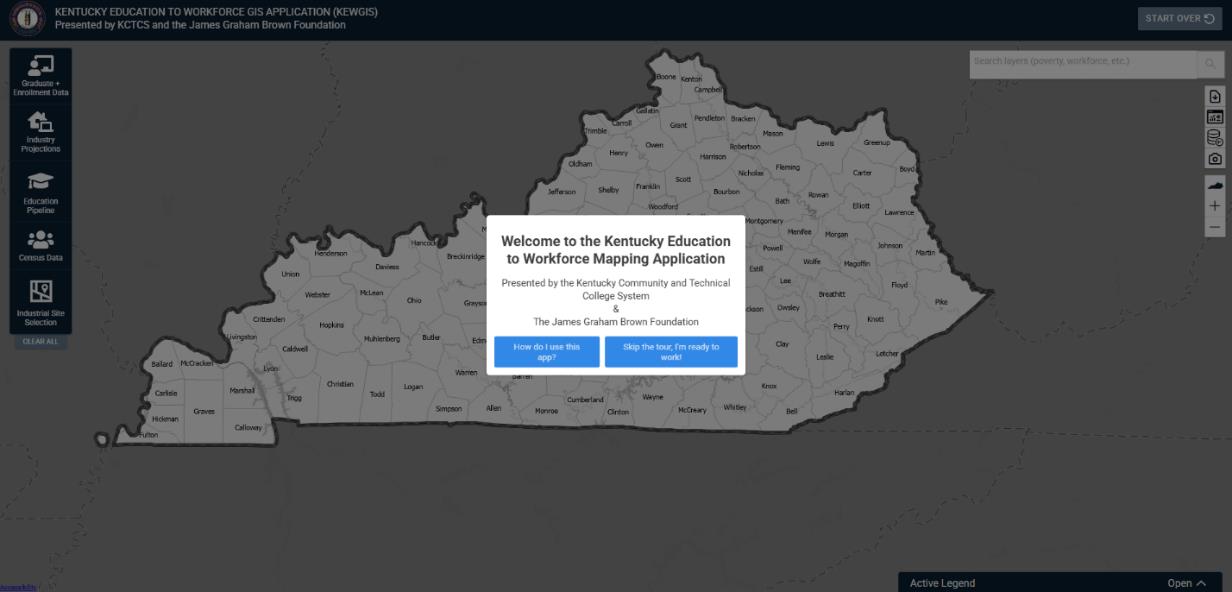
Figure 1 highlights the starting screen of the Kentucky Education to Workforce GIS Application (KEWGIS). The initial starting screen begins with a prompt that allows the user to be taken through a tour of the application. To start the tour click on the blue button on the left. To skip the tour click the blue button on the right of the initial prompt. The main user interface is controlled by widgets on the right and left side of the page. On the right side, in order, there is a data user guide (this very file), a link to KCTCS’ Program Alignment Tool (A very useful resource for workforce development in its own right), a link to the data within the application ready for download, a button to screenshot, and buttons to reset the view as well as zoom in and out. On the left side of the page are the main ‘data widgets’ that contain spatial data. These are separated by topic. Clicking on the primary ‘drawer’ will open up sub-options, which are separated by data source. As of today (12/4/2025) there are 5 main widgets – Graduate + Enrollment Data, Industry Projections, Education Pipeline, Census Data, and Industrial Site Selection. Selecting a layer will overlay it onto the map. Several layers can be overlayed at once, revealing important relationships between topics. Additionally, this will pull up the active legend in the bottom right corner of the page – here you can control the opacity and ordering of the layers. The overlay of these layers can be clicked to bring up a popup representing data within the chosen geography.
Figure 1: Kentucky Education to Workforce GIS Application Starting Screen
Data:
The data used to create the application were collected from the Kentucky Community and Technical College System (KCTCS), the Kentucky Department of Education (KDE), the Council on Postsecondary Education (CPE), Kentucky Center for Statistics (KyStats), Kentucky State Data Center (KSDC), Bureau of Labor Statistics (BLS), Kentucky Cabinet of Economic Development, and the ACS Census (American Community Survey). These data sources are used to create a unique combination of education and workforce data that provide a multidimensional perspective on education and workforce alignment in Kentucky. The application design team consulted with experts from state organizations to establish data needs and organize the scope of the application.
The application aggregates most data points to the county level; however, some layers are at the institution, census tract, and census block level. County level aggregation was selected as the main unit for the application due to the availability of data and the flexibility to aggregate to higher order aggregations like local workforce areas (LWAs). Where possible, layers are aggregated to smaller spatial scales like addresses (points), Census tracts (neighborhood proxy), and Census blocks (sub-neighborhood). Also, for applicable data, the application includes LWAs and “all county” aggregations so users can easily compare a single county to its LWA or the entire state. Aggregation is not limited to a broader geographical unit, however. The application contains layers that have either been aggregated to or simply represent a specific institution or ‘point’ on the map. Clicking on the points themselves functions the same as the aggregations to geographical unit.
Suppression:
To ensure the data presented in the application are anonymous and unidentifiable any aggregated data points with fewer than 10 records were suppressed. In instances where time-series data were interrupted due to suppression, synthetic data were used to fill gaps allowing the time-series to be used for estimation purposes (time-series analyses do not like gaps in the data). Thus, any value displayed in the application that is less than 10 was synthetically created by the research team for estimation purposes only. In some instances, count-based data (which should only be whole numbers) may display with decimal values because the values are statistically estimated.
Statistical Methods:
Forecasting:
A key principle in the development of the application was to focus on the future of education and workforce alignment in Kentucky. Taking a proactive approach focused on the future steered the project design team toward the development of education and workforce forecasts that allows the application to align with state strategic planning efforts that are currently focused on years 2026 and 2030. Predicting the future is a challenging task because it is impossible to anticipate all the factors that drive education and workforce supply and demand. Additionally, predicting the future for each county in the state is difficult because each county has unique needs, challenges, and opportunities that impact education production and workforce demand. Because of the large number of counties and industry sectors, the design team created a flexible forecasting algorithm that produces high quality forecasts on a large scale and offers easy manipulation of specific county forecasts if the general algorithm produces unlikely outcomes.
Random-Forest Forecasting:
Forecasts in this application were built using one of two methods. The first, and the one by which the majority were built, is a machine learning method called random forests. The random forest forecasts are estimated in ArcGIS PRO using ‘space-time cubes’, which are three-dimensional data models used to organize data with space and time dimensions. The forecast model is constructed by building a series of decision trees called “forests” that are used to estimate each time series for each spatial unit (e.g., county).
Further information detailing the method (such as training the model, extending the scale) can be found here: How Forest-based Forecast works—ArcGIS Pro | Documentation
In some instances, the data used to create these forecasts had missing data points throughout the time series. To address gaps in the time series the forecast algorithm interpolated values when it was feasible using a linear interpolation technique. To ensure the interpolation procedure was appropriate, some data series were eliminated due to a lack of available data. Limiting the forecasts to industries that have a minimum number of data points bolsters the accuracy of the forecasts that are produced by relying on observed data. Additionally, each data series has unique conditions that the algorithm can be adjusted to address. Several time series were enhanced by incorporating predictor variables, lagged variables, or other parameter adjustments that produce more logical forecasts. These adjustments help moderate the forecasts in various ways to produce outcomes that are more likely given the historical performance of the data.
Auto-ARIMA Forecasting
The second method utilized autoregressive integrated moving average (ARIMA), which is a class of statistical models that are applied to time series data for the purpose of forecasting future events. The ARIMA model is composed of three components, which are labeled p, d, and q. p is the autoregressive component of the model that captures the impact of past values on present and future values; d is the differencing of data to produce stationarity1 in the model; and q is the moving average component that captures dependency between lagged observations. The ARIMA model requires the selection of the most appropriate combination of p, d, and q to produce the best estimates. Typically, the ARIMA model is shown using (p,d,q) notation following the calculation of the ARIMA model to indicate the conditions applied in the model. For example, the simplest model is (0,0,1) which is a simple moving average model that predicts the dependent variable based on a first order moving average. There are several options for selecting the best model including examination of Mean Absolute Percentage Error (MAPE), Akaike Information Criterion (AIC), and Bayesian Information Criterion (BIC) statistics. Due to the large number of forecasts needed to produce county-level coverage of education and industry time trends, a flexible algorithm was needed that “searches” for the best possible ARIMA model by simultaneously estimating models with multiple combinations of p,d, and q. The forecast algorithm then selects the model that results in the lowest level of prediction error. All forecasts in the application were created using STATA 19. For a more detailed discussion of STATA’s forecasting methods explore the STATA reference manual for ARIMA models. 1
This forecast algorithm can estimate up to 16 models for each variable in each county, which produces many forecast “candidates” from which the algorithm can choose. However, due to data limitations some forecast adjustments can produce fewer candidate forecasts for the algorithm to choose from, which is typically true of data series that are short in duration or that have low volume and high frequency (i.e., variation). After the forecasts were calculated and selected, the research team evaluated and adjusted the models when needed. For example, in some instances strongly declining time trends yielded negative job forecasts, which is not possible in the real world. In those situations, the research team tested various adjustment to determine the best fitting models. An important point to emphasize is that both forecasting methods used building this application may be altered as new information arises. These forecast adjustments will not occur regularly but will be made in response to new knowledge or insights related to specific counties or industry sectors.
Trend Layer Analysis:
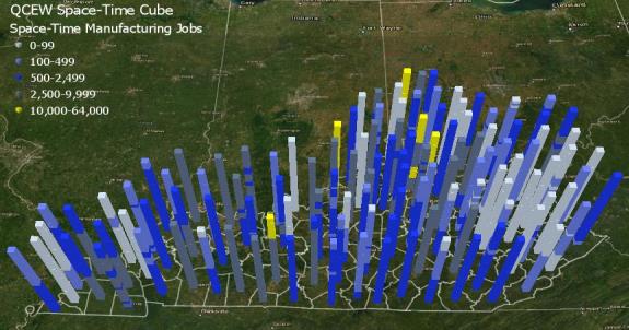
In addition to forecast layers, the application also includes layers that display time trends. The key purpose of the trend layers is to display, in a single map, the direction of the time trends in each county. Where forecasts layers show what the forecasted variable will look like in one year, the time trend layers show how the county’s industry sector trajectories are changing across years. The data structure used to calculate the trend layers is three-dimensional (3D), which means variables are measured both spatially and temporally. Formally, this data structure is called a space-time cube because when data are visualized in 3D they appear to look like stacks of cubes. Figure 2 shows an example of a space-time cube for manufacturing jobs in Kentucky counties measured each year from 1990 through 2019. Each year is represented by a single cube, which is stacked to create a tower-like shape. The top of the tower is the cube representing the final observation and the cube at the bottom of the tower represents the first observation. When the 3D maps are converted to a 2D map, the image below becomes flat and the counties are shaded to indicate whether the time trend is increasing, decreasing, or not changing.
Figure 2.1: QCEW Space-Time Cube for Manufacturing Jobs
The space-time cubes can be applied to the forecasted data by applying additional analyses that evaluate and visualize the growth patterns of the forecasts. The trend analysis categorizes counties based on the direction of their trends. The classification of the counties based on the direction of the time trend is determined by the Mann-Kendall 6 trend test. The Mann-Kendall trend test is a rank correlation analysis, which means each time point is compared to the next time point in the series and then given a score of +1, 0, or -1 indicating whether the trend increases, decreases, or has no change. The changes are summed across the time series and then compared to the expected sum, which is zero. If the summed scores deviate significantly from zero, then the county is assigned to an increasing or decreasing group depending on the direction of the trend. If the scores are not significantly different from zero, then the county is classified as having no significant trend. The main advantage of the trend layers is that they allow users to view each county’s time trend simultaneously. This allows users to explore the spatiotemporal aspects of the data by viewing time and space patterns on a single map. For a more detailed discussion of the calculation of trend layers see the ArcGIS Pro reference guide.
Figure 2.2: QCEW Trend Layer
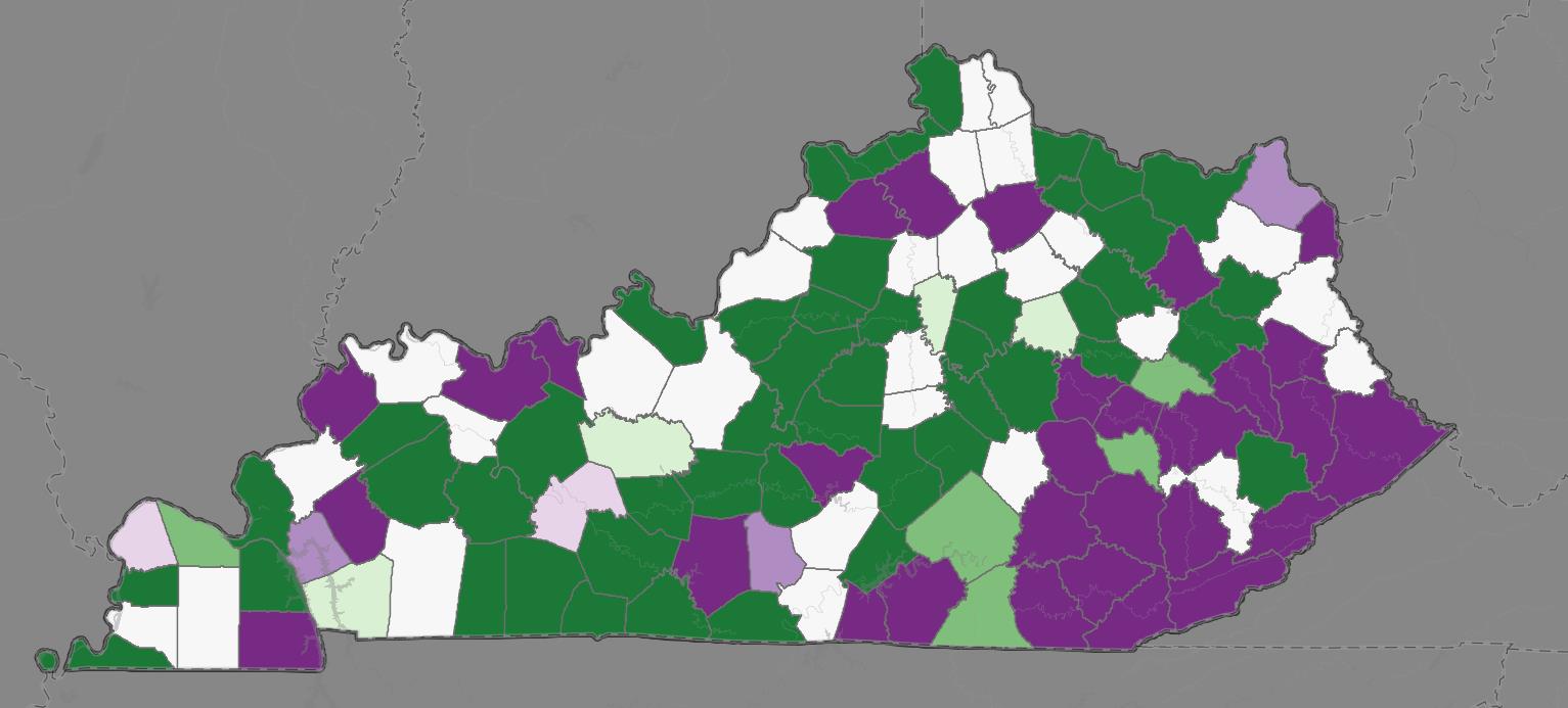
Construction Industry growth trends in KY (2030 Forecast). Color indicates direction and intensity of trend.
Graduate + Enrollment Data:
The Graduate + Enrollment Data widget measures the number of graduates and enrollments at K-12, KCTCS, and Public/AIKCU 4-year institutions. Each ‘drawer’ of this widget is separated by the data source and whether it’s presenting the enrollment for the institution or the graduates (deduplicated). The data within is presented as a projection to be of use as a predictive measure, separated by grade and degree level. They are supplemented by ‘trend’ layers that display the rate of increase/decrease or lack thereof. Table 1 outlines the data sources, CIP-Level, timeframe, and the degree types included.
| Enrollment + Graduate Projection Data Sources | Description | CIP-Level | Time Series | Degree Type(s) |
|---|---|---|---|---|
| KCTCS CPE Official Data | KCTCS Enrollments/Graduates | 2-Digit | 2000-01 to 2023-24 |
|
| Public/AIKCU 4-Year CPE Official Data | Public 4-Year Enrollments/Graduates | 4-Digit | 1990-00 to 2023-24 |
|
| KDE SAAR Report | K-12 Student Enrollment | N/A | 2006-07 to 2024-25 |
|
Industry Projections:
Quarterly Census of Employment and Wages (QCEW): Total Jobs and Average Weekly Wages
The Quarterly Census of Employment and Wages is a U.S. Bureau of Labor Statistics program that publishes quarterly data on the number of jobs and average wages reported by employers covering more than 95% of jobs in the United States. QCEW data allows users to understand spatial and temporal changes in jobs and wages across 20 NAICS industry sectors. The QCEW data was collected from KyStats and is also in time-series format (1990 – 2023). Again, the time-series data are used to produce forecasts of jobs and wages in each county and across the 2-digit NAICS industry sectors. The industry projection metrics identify the number of jobs in each industry sector, and the industry trends visualize the county-level time trends of jobs by industry sector. Counties in the trend layers are classified based on the degree to which the time trend is increasing, decreasing, or not changing over time. The wage projections identify the average weekly wage for each industry sector, and the wage trends show the county-level time trends of wages by industry sector.
Quarterly Workforce Indicators (QWI): Job Creation
Quarterly Workforce Indicators (QWI) is a dataset produced by the U.S. Census Bureau that measures 32 different workforce and economic indicators, such as employment, job creation/destruction, wages, and hires. These data are connected to characteristics like geography, age, industry, and size as well as worker demographics. Available data can be measured to the national, state, metropolitan/micropolitan areas, county, and workforce investment areas (WIA). By tracking workplace and worker characteristics over time, QWI data allows for longitudinal analyses of various issues concerning employment, labor market needs, and economic health.
Within the Kentucky Education to Workforce dashboard, QWI data were utilized to measure job growth over time in 20 industries as well as predict future job growth in those industries out to 2030. The inclusion of QWI data within the application allows users to assess employment trends across different industries at different points in time, enabling them to make informed decisions about education, investment, and future economic prospects. Currently QWI is used to build out the Job Creation Projections/Trends in the application – an estimate of the number of jobs gained in each CIP code defined industry. The inclusion of this widget allows users to see the counties with the most new jobs, the industries most likely to create new jobs, and which industries are most likely to create jobs that younger or entry level workers are likely to obtain. For more detailed information about the QWI visit the U.S. Census website. Table 2 below contains additional information on the data used producing this widget.
Figure 3.1: QWI Job Creation Projections
| Source | Description | Time Series |
|---|---|---|
| QCEW | Total Jobs | 2000 – 2023 |
| QCEW | Average Weekly Wages | 2000 – 2023 |
| QWI | Job Creation | 2002 – 2023 |
Education Pipeline:
The education pipeline widget includes several different measures that represent the flow of education and training to the workforce. These are produced at the institution level, rather than aggregated to a geographic grouping. Table 3 below lists these data sources, as well as which institution(s) they represent. Point level institutional layers allow networks to be built between the different institutions (for example, the link between dual credit high school students and the post-secondary institution they enroll in.)
| Layer Group (Drawer) | Description | Source + Vintage |
|---|---|---|
| Education Programs Offered by Kentucky Institutions | Available courses for a selected institution | KDE (2023) CPE (2022–23) |
| KCTCS Registered Apprenticeship Locations | KCTCS offers apprenticeships from organizations tied to a college | KCTCS (2025) |
| KCTCS Transfers to 4-Years | Students from the 2021–22 KCTCS cohort that went on to transfer to a 4-year institution in the following year | KCTCS, CPE (2021–2023) |
| Postsecondary Matriculation Networks | Network pathway for 2022 high school graduates to postsecondary institutions | KDE, KYSTATS (2022) |
| High School Dual Credit/Dual Enrollment Networks | Student tracker of matriculation to enrollment for 2022 dual credit students | KDE, KYSTATS (2022) |
| Educational Institution Locations (various) | Schools, districts, local workforce areas, enrollment | KDE, KCTCS, CPE, KYSTATS (2020–Present) |
| Kentucky Schools Technology Access | Computer and internet access for students at the high school level | KDE (2023) |
Census Data:
The Census Data widget includes a set of layers that measure important socioeconomic conditions throughout Kentucky, all sourced from the American Community Survey (ACS) done by the United States Census Bureau. The widget is divided into subsections based on whether it is at the county or census tract level, and whether it is a cross section or time-series analysis. Variables chose are included in Table 4 below, with their accompanying geographic aggregation and whether it is a cross-section or timeseries (or both.) Included in this set of layers are population projections (with data from KSDC supplementing the ACS), as well as estimates of education attainment, also sourced from the ACS. Projections are estimated to 2029 or 2030 for all applicable variables.
| Census Subject | Geography | Timeframe | Years (Data Source) |
|---|---|---|---|
| Poverty | County, Tract | Cross-section, Timeseries | 2023, 2012–2023 |
| Unemployment | County, Tract | Cross-section, Timeseries | 2023, 2012–2023 |
| Civilian Labor Force | County, Tract | Cross-section, Timeseries | 2023, 2012–2023 |
| Dependent Ratio | County, Tract | Cross-section, Timeseries | 2023, 2012–2023 |
| Median Income | County, Tract | Cross-section, Timeseries | 2023, 2012–2023 |
| Public Assistance | County, Tract | Cross-section, Timeseries | 2023, 2012–2023 |
| Gini Index | County, Tract | Cross-section, Timeseries | 2023, 2012–2023 |
| Access to Computing Devices | County, Tract | Cross-section | 2023 |
| Access to Internet Services | County, Tract | Cross-section | 2023 |
| Broadband Internet Access | County, Tract | Cross-section | 2023 |
| Health Insurance Coverage | County, Tract | Cross-section | 2023 |
| Veteran Population | County | Cross-section | 2023 |
| Population Projections | County | Timeseries | 1960–2022 |
| Education Attainment Projections | County | Timeseries | 2012–2023 |
Education attainment was incorporated into our estimates because KCTCS and CPE’s statewide strategic priorities emphasize raising attainment levels across Kentucky. CPE’s overarching goal is for 60% of Kentucky’s population over age 25 to have a postsecondary credential by 2030. CPE’s 60-by-30 goal is a statewide goal, but it is likely there will be substantial variation in the ability of each Kentucky county to achieve the goal. Therefore, the education attainment projections provide new insights into the 60-by-30 goal by providing county-level forecasts of education attainment out to year 2030. The insights of looking at specific counties can provide insights into where the 60-by-30 goal is likely to be achieved and where additional resources may be needed to achieve the goal.
The 60x30 metric is calculated by combining education attainment variables for associate’s degree or higher among the population over age 25. One limitation of using Census data for this calculation is that the U.S. Census does not currently collect data on certificate and diploma completion as separate credential categories. However, under CPE’s definition of 60x30, certificates and diplomas count toward the attainment goal, and in fact, certificates make up the largest total volume of credentials due to their relatively short time-to-degree. To address this limitation, we added 50% of the Census education attainment category “some college no degree” to create an estimate of students who have completed short term credentials but may not have completed an associate’s degree.
Industrial Site Selection:
The Industrial Site Selection widget was added to provide a view of industrial capacity across the state. Through it we can see which areas of the state are currently being utilized, 12 which are developed and ready for use, and which are so far undeveloped. It is organized into several drawers that differ substantially in their subject matter and underlying data than the other widgets, since industrial capacity depends on both capital investment and human capital. These categories and their layers, along with their descriptions, vintages, and sources, are outlined below.
- Industrial Sites – Available industrial areas in Kentucky (Kentucky Cabinet of Economic
Development, 2023)
- Available buildings
- Available sites
- Site boundaries
- Build ready tracts
- Site tract status
- Inactive site points
- Inactive site boundaries
- Inactive site tract status
- Industrial Infrastructure (US Gov., ESRI, 2025)
- US Freeway System
- US Navigable Waterways
- North American Railway Network
- Power Plants within 50 miles of KY
- Local Area Unemployment Statistics (projection and trends) (LAUS/BLS 1990–2023)
- Civilian Labor Force
- Employed Population
- Unemployed Population
- Unemployment Rate
- Commuting Patterns (LEHD, 2022)
- Total Jobs
- Age 29 or Younger
- Age 30 to 54
- Age 55 or Older
- Earnings $1,250/month or less
- Earnings $1,251/month to $3,333/month
- Earnings Greater than $3,333/month
- Good Producing Industry Sectors
- Trade, Transportation, and Utilities Industry Sectors
- All Other Service Industry Sectors